Advanced Excel Charts & Visualizations
Tell your data story effectively
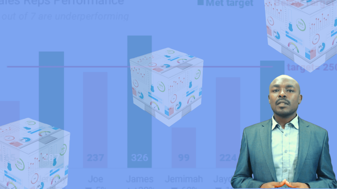
Learn the secrets to create magazine-style charts and visually-rich tables that grab user attention!
Looking for creative ways to present your numbers with impact?
If you’re willing to think beyond rows, columns, and primitive pie charts, then you can use Excel to achieve impressive visualizations (charts & tables) that will add credibility to your reports and presentations.
Through interactive and hands-on demos and exercises you’ll learn modern data visualization techniques that have close resemblance to creating infographics!
Fairly all the charts presented in this course can be created in both Excel and PowerPoint
And…
I’ll also show you how to create themes (a colour palette and fonts) that you can access across Excel, PowerPoint and Word …to save you having to look for your coporate colour codes
Introducing
Effective Charts and Visualizations [Excel & PPT]
Get ready to ace your next presentation.
We’ll dive into both simple and advanced, but creative techniques that allow you to create your own Excel charts and visually-rich tables from scratch …with confidence
Engaging Reports
Designer-ready charts will grab attention of your audience and elicit discussion and action on your insights
Career Progression
Data visualization is a highly sought after skill. Accelerate your growth by arming yourself beforehand
Save Time
You'll learn time-saving techniques such as creating a theme, chart templates and interactive charts
Client Speak
Here’s what people are saying about the course


What You'll Learn
Module 1: Getting Started: Hidden Tricks for Common Charts
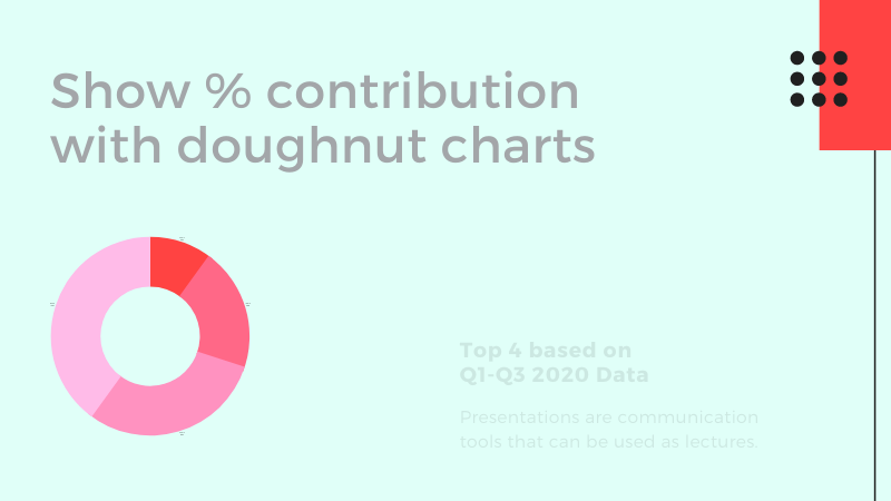
Here we'll delve on how you choose a certain chart over another. We'll look at the standard charts in Excel - Column, Bar, Doughnut, Line charts -their uses and best practices, as well as how to configure them for a professional finish. You'll learn to add a target line, highlight highest/lowest value in a column/bar chart dynamically and how to achieve a multi-category chart.
Module 2: Grab Attention with Non-Standard Charts
Non-standard doesn't mean you get another tool... We'll look at some of the unconventional charting techniques: bar-in-bar charts, representing KPIs using magazine style stylish pie charts, KPI ring charts, waffle and progress bar charts, tracking progress towards a goal with gauge, bullet and thermometer charts, the bullet-proof way to create waterfall charts to visualize net changes from a start value to and end value. We'll also explore lollipop charts a departure from the usual column charts, as well as the index chart and why you should start using it.
Module 3: Adding Interactivity to Charts
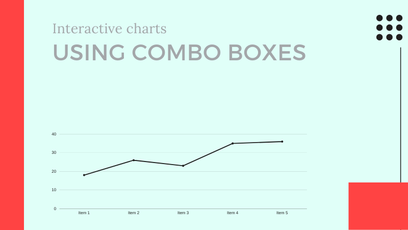
We'll explore how you use the following tools in Excel to achieve dynamism: drop-down lists, combo boxes, option buttons, special Excel tables, the OFFSET function. I'll walk you through how to create scrolling charts in Excel to help maximize your spreadsheet space
Module 4: Conditional Formatting & Custom Number Formats
Visualizations is not just about charts. Some managers want to just see tables and numbers. In this module we'll see how to enrich your tables with conditional formatting icon sets, traffic lights and colour scales. We'll then look at custom number formats for up/down arrows for variance analysis, as well as how to format a number from, say 3,765,345,546 to 3.77b
Module 5: Creating Themes & Creative PowerPoint Tips
Create as many colour palettes that you can always retrieve depending on the colour set you want to apply to your reports -pivot tables, charts, shapes or special tables. We'll look at how you transfer your charts to PowerPoint and 20 tips of achieving great PPT designs
Preview Sample Lessons

Your go to library of modern charting techniques
There are numerous charting concepts but we tend to forget where to get them. We’ve picked the essential ones and packaged them in this structured course that you can access anywhere, any time, for a lifetime!
Lifetime Access
-
5.5 hours on-demand video lessons
-
Downloadable files and resources
-
Lifetime access to the course
-
Certificate of completion (digital, print)
-
Access on mobile, anytime
-
Immediate start
-
Lifetime updates at no extra charge
If you have a coupon, click buy and apply it in the next page

30-Day Money-Back Guarantee
If you’re unhappy within the first 30 days, for whatsover reason, we’ll refund your fee 100%. No questions asked.
Meet your Instructor

Hi, my name is William.
Since 2012, I’ve consulted for various corporate clients regarding their reporting processes in Excel.
I’ve trained thousands to use Excel productively at the work place as well.
I’m on a mission to help you slash down the time you take generating reports, while churning credible reports.
Am here to facilitate your success story …and possibly learn from you through our interaction.
William Kiarie

Sharing is Caring
Know of someone who can benefit from this? Why don’t you share with them on your preferred platform! Thank you in advance for helping me help them.
Clear any doubts
The concepts in this course work with all versions from 2010 and above. Only the screen windows will vary slightly, but I’ll highlight where to go for your version
Absolutely not. We’ll be working with native Excel and PowerPoint features.
You have immediate access once you complete payment. And yes, you have unlimited access henceforth.
You pay only one for the course. No annual renewal fee.
We’ve put every effort to make this course relevant and practical. All we ask is that you really give the course a good go. Should you be unsatisfied for whatsoever reason within the 30 days window from day of purchase, we’ll be happy to refund in full. No questions asked!
Once you have completed the course, you’ll acquire official Certification from DCA and you can download or share in your social circles.
2020 DCA Online Academy | All Rights Reserved

